Poster Display Instructions
Poster presentations play a key role in the exchange of information. Time is dedicated to viewing them, giving scientists, policy makers, planners, practitioners and managers valuable opportunities to interact and share details of their work, successes and lessons learned.
Poster Display Specifications

- Posters are divided into two time slots during the Poster Session (one hour each).
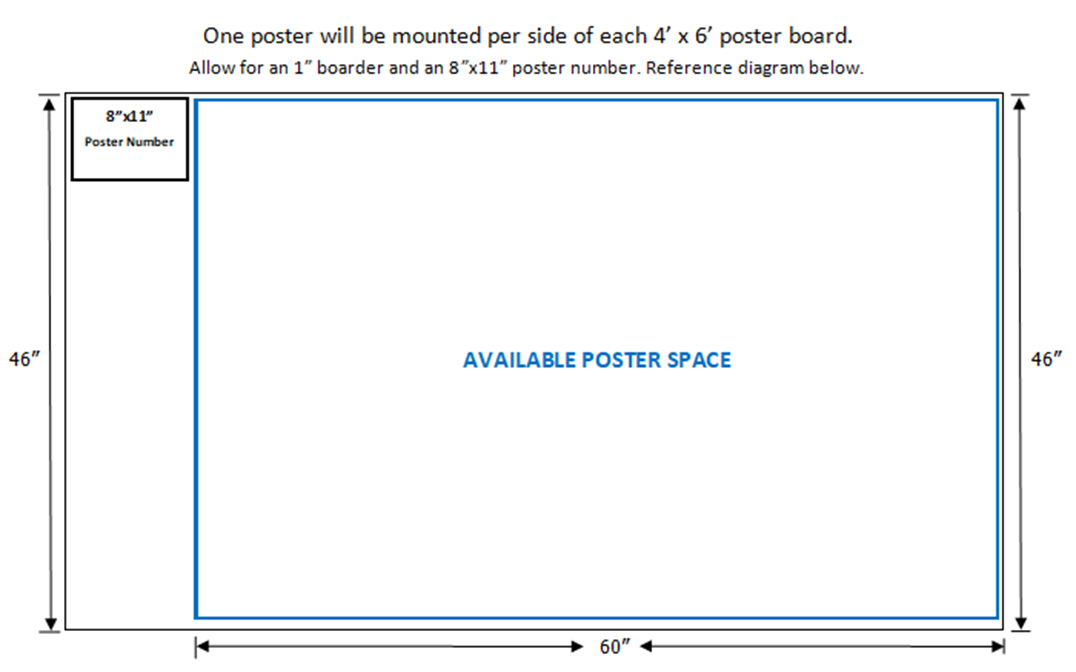
- Posters are limited to a maximum size of 46” high x 60” wide. If your poster exceeds these dimensions, your poster will not fit and poster visibility will be compromised.
- Please follow size limits so you do not encroach on your neighbors poster display.
- Each poster will be assigned a number in advance. We number the board, so you don’t need to put a number on your poster.
- Poster boards are freestanding and contiguously connected.
- Presenters must use the boards provided.
- Poster boards are covered with fabric. A limited supply of Velcro is provided. If your poster is heavy, you may want to bring an extra supply.
- A formal poster session is scheduled Tuesday.
- Presenters are to be at their poster during their assigned Poster Session. As a courtesy to the presenter before/after you and to promote social-distancing, please only stand at your poster during the assigned session.
Poster Session
| Poster Installation: |
Monday, February 21, 1:30pm-5:00pm -OR- Tuesday, February 22, 7:30am-1:30pm |
| Formal Poster Session: | Tuesday February 22, 3:00pm-5:00pm |
| 3:00pm-4:00pm | Poster Session One |
| 4:00pm-5:00pm | Poster Session Two |
| Poster Removal: | Wednesday, February 23, Before 3:00pm |
Poster display boards will be dismantled by the vendor during the closing plenary. Please have your poster removed by 3:00pm Wednesday. Organizers are not responsible for lost posters discarded by the board vendor. Thank you.
Poster Development Tips
- Your poster should cover the same material as your submitted abstract.
- Place the title of your poster prominently at the top, author names and contact information beneath.
- Highlight the poster title and subheading with colors or colored lines.
- Headings and subheadings should be at least 25% larger than the main copy.
- Don’t crowd too much information on the poster. Concentrate on 2-3 main points.
- Minimize complete sentences and paragraphs.
- Prepare all diagrams or charts neatly and legibly in a size sufficient to be read at a distance of two meters.
- Paragraph and figure caption text should be at least 24-point font (0.9 cm height) and headers at least 36-point font (1.2 cm height).
- Use squares, rectangles, circles, etc. to group like ideas. Don’t clutter your poster with too much text.
- A serif font (e.g. Times) is often easier for reading main text, and a non-serif font (e.g. Arial or Helvetica) is suggested for headers and labels.
Please Note: Email j.bailey@ufl.edu no later than 60-days prior to the symposium if you have special placement requests.
